HumanToolz: Making the iPad a Bit More Usable

Photo of HumanToolz iPad standAs much as I love my iPad, I have to admit it has a problem. Holding it gets tedious and is generally impractical while typing. And getting it to sit in a vertical position requires and external support of some kind.

Apple’s solution to this is hopeless. The Smart Cover works very well to protect the screen, but is a miserable stand. It only works at one angle and at the slightest provocation, its magnetic strip detaches from the iPad, which then topples over. There are many other stands available, but they tend to be clumsy, ugly, inflexible, or all three.

Enter the HumanToolz Mobile Stand, available for $65 as a preorder on Kickstarter; delivery is expected in November.) It’s a handsome aluminum device–the color on my preproduction model almost but didn’t quite match Apple’s–that supports a third-generation iPad or iPad 2 in positions from nearly horizontal to nearly vertical in landscape mode. (In portrait it is limited to a position 11 degrees off vertical.)

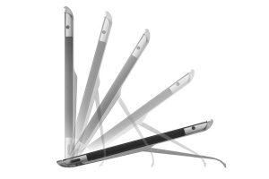
The stand consists of two thin bars that snap firmly to the iPad’s corners. A support piece shaped like a broad U attached to the middle of these bars with a clever hinge that rotates smoothly, without detents, through nearly 180 degrees but remains securely in any position you put it.

The stand weighs just 2.5 oz. (71 g) and is 5 mm thick at its thickest point, the hinge. It doesn’t really add appreciably to the iPad’s weight or bulk, a good thing since it is just hard enough to remove that you won’t want to put it on and off terribly often.

I found I used the HumanToolz stand in a variety of settings: Propped near vertical on a desk for table for reading or for use with my ZAGGflex keyboard, a bit above horizontal for typing on the on-screen keyboard, propped at a comfortable angle on my legs while sitting, or at a slightly less comfortable angle on my belly while lying down.

HumanToolz funded production of the stand by raising $88,600 on Kickstarter and it will be available online and in stores. Apple has kept stands other than the Smart Cover out of it retail stores, maybe on grounds of general ugliness. They ought to give the HumanToolz version a good look.

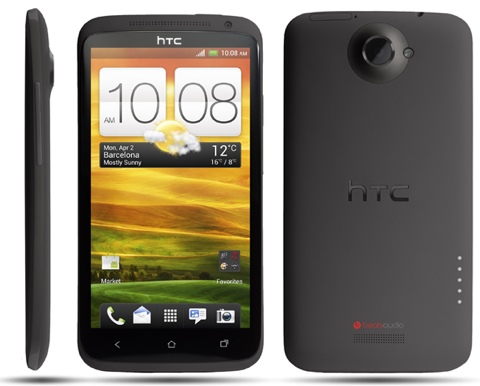
HTC One X International: Trading in My iPhone 4S?

One X

HTC announced the HTC One family in Barcelona at Mobile World Congress 2012. The HTC One X was one of the bigger standouts as it indicated the best in breed of Android phones available on the market. Some even said it would threaten the iPhone. Does it live up to the hype? I had the chance to use the HTC One X International version for a few days and I wanted to share my first hand experiences with you, which were very positive.

Background

I have been evaluating Android phones well before the first T-Mobile G1 launched back in 2008. I was a BlackBerry addict like many for so long until the Nexus One arrived, then I switched to Android wholesale….. for a while. The iPhone 4 finally pulled me from the Android world with its consistent performance, robust app store, quality photographs, and perfected HDTV Airplay mirroring functionality. Could the HTC One X International pull me back over to Android with its much more sophisticated ICS Android 4 operating system and higher quality app and media store? Maybe.

What I Enjoyed About the HTC One X International

Facial Login
I have been evaluating face login for about a decade and this is one of the first I have used that worked well. It’s missing a few features like auto-adjusting the display to provide light, but it worked well in most environments. If it did miss-read my face, it backs off to a secondary security method like typed password or drawing a pattern. I have not tested for false positives using photographs or videos either.

Multitasking
Quite simply, I have never used a phone this fast and did so many tasks at the same time as I did with the One X International; installing apps, updating apps, syncing Sugarsync data, and browsing in Chrome Beta at the same time were very fast. As hard as I tried to slow the system to a crawl using real apps and not benchmarks, I failed. This is a first for me as I had previously tried nearly every major flavor of Android phone. I attribute most of the multitasking prowess to the Nvidia Tegra 3 processor with its 4-PLUS-1 quad core architecture. When doing heavy multitasking, all four cores were blaring. When reading email, it only uses the one battery-saver core.

Display
The One X sports a monster 4.7″ HD display at 1,280×720 resolution. In comparison to my 4S, this provides 60% larger viewable image area at a very comparable PPI (pixels per inch). The contrast ratio was one of the best I had ever experienced, too. The georgous display made web surfing, viewing photos, watching movies, and playing games a very enjoyable experience.

Games
This is where the One X showed one of its key strengths. I prefer the eye candy and my preferred games are FPS (first-person shooters). I tried many of the titles in the Nvidia TegraZone to stretch the Tegra 3 as far as it would go. ShadowGun THD looked great not only on the integrated display, but also when displayed on a 60″ HDTV screen. I have an XBOX 360 and while I wouldn’t say it’s the same quality graphical experience as the latest Halo, it is close. To have this capability built into a phone, for “free”, is exceptional. I can see how tomorrow’s phones based on Tegra graphics will give future consoles a run for their money.

Camera
The camera experience overall was positive. I appreciated the fast, multi-picture taking capabilities and taking pictures in low light. I thought my iPhone 4S was fast, but the HTC One X was even faster. I also appreciated taking pictures while I was taking videos, and I can imagine making some very interesting photo-video mashups. Unlike the iPhone, I’m not limited to sharing my pictures from Photos just to Twitter. Right from Gallery, I can share to Facebook, Dropbox, SkyDrive, Flickr, Instagram, Picasa, Skype, and yes, Twitter.

Battery Life
I was pleasantly surprised with the battery life as I didn’t notice many demonstrable differences between the One X and my 4S. One area was web browsing where I was using Chrome beta on the One X, which delivered a fuller web experience than Safari, but felt like it was using more battery. Most impressive was that I could get decent battery life with a four core processor, great mobile graphics, on a display with 60% more area. I have to admit, when I first heard about Tegra 3 on phones, my head went directly to concerns on battery life. Nvidia pulled off something real big by enabling good battery life while having four processor cores and Nvidia graphics.

What I Would Like to See Changed About the HTC One X

Size
This is a personal preference, but I like to control the phone with my thumb, without two hands. . The One X requires me to use two hands which rules it out of quick stop-light usage in the car. Techpinions columnist Ben Bajarin goes into depth here on this idea here.

Charging
Like I said above, I like to multitask with my phone, using it more like a mini-tablet than a simple phone. As I would near the end of a battery charge, I would plug in the phone so I could keep playing or working. Often, I would get a warning message warning me that I was draining power quicker than I could charge the unit. This will hopefully get addressed in a software update as it is inconvenient.

Packaging
A beautiful phone deserves beautiful packaging. If you like eggs, great. The One X ships in what looks like a giant, single egg carton. The phone is beautiful and deserves to sit right next to the iPhone 4S, but the packaging should be hidden from human eyes.

Photo Skin Quality
All my shots of people outside in bright sunlight has a red or pink tinge to their skin. Either I had a defective unit or some calibration is required in the driver. I scoured the web and found a few instances of this happening to others. I cannot imagine this not getting fixed.

Trading in my iPhone 4S?


As I said previously, I prefer smaller phones I can control with one thumb. For those who desire the benefits of a larger display phone like the HTC One X International version, I can recommend this phone to those who don’t have access to LTE. The multitasking and games are better than anything I have used to date and when combined with the awesome 4.7″ display, the One X satisfies.

The Dell XPS 13: An Ultrabook that Could Steal Customers From Apple

If you are in the high-tech industry and haven’t heard of the term “Ultrabook”, you’ve probably been on sabbatical or have been living under a rock. Intel introduced an industry-wide initiative to re-think the Windows notebook PC, which they have dubbed and trademarked the “Ultrabook”. Launched at Computex 2011, Ultrabooks are designed to be very thin and light, have good battery life, have instant-on from sleep, be more secure and have good performance. If you want to see the details on what constitutes an Ultrabook, let me direct you to an article I wrote in Forbes yesterday. Does this sound a bit like a MacBook Air? This is what I thought about the entire category until Dell lent me their Ultrabook, the Dell XPS 13, for a few days. I have to say, I am very impressed and believe they have a winner here that could take some business from Apple. I don’t make that statement lightly as my family is the owner of three MacBooks and I do like them a lot.

Dell plays hard to get
When Ultrabooks were first introduced in July, Dell was somewhat silent on their intentions. Typically Dell is locked arm in arm with Intel many steps of the way. When they didn’t introduce an Ultrabook by the back to school selling season, “industry people” started to ask questions. When Dell didn’t release one by the holiday selling season, people were asking, “what’s wrong with the Ultrabook category”, or “what is Dell cooking up”?

I thought they were waiting for Intel’s Ivy Bridge solution that was scheduled for earlier in the year. Whatever Dell was waiting for doesn’t matter, because they did nothing but impress at CES. During the Intel keynote with Intel’s Paul Otellini, Dell’s vice chairman Jeff Clarke, stormed on-stage with some serious Texas swagger. The video cameras at the CES event didn’t do the Dell XPS 13 justice as it’s hard to “get” the ethos of any device on camera, but with Jeff Clarke and Paul Otellii on stage, you knew it was important to both companies. In my 20+ years as PC OEM and technology provider to OEMs, I believe the only way to really “get” a product is to live with it as your primary device for a few days. And that’s just what I did.

Industrial Design
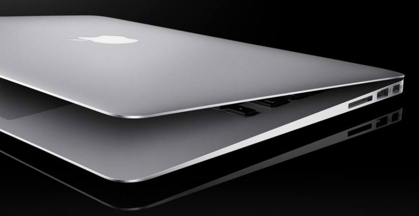
It’s apparent to me that Dell took their combined commercial and consumer experience and put it to good use. Rather than just follow Apple, HP or Lenovo, they put together what I would call the best of both worlds. The machined aluminum frame adds the brawn and high-brow feel, while the rubberized carbon-fiber composite base serves to keep the user’s lap cool and reduce weight. The rubberized palm rest provides a slip-proof environment that adds serious precision to keystrokes and trackpad gestures. It also provides a slip-proof mechanism for carrying the unit across the house, the office, or into a coffee shop. In a nutshell, Dell solved my complaints about my MacBook Air and made it look, feel and operate premium.

Instant-On
I give Dell and Intel credit for working together to make Windows 7 PCs almost “instant on”. The XPS 13 turned on and off very quickly thanks to Intel Rapid Start and Dell’s integration. I wasn’t able to use Smart Connect, but when I can use the XPS 13 for a few weeks I want to try this out. This is essentially a feature that intermittently pulls the XPS out of sleep state and pulls in emails and calendar updates. While this is as close a PC will get to “always on, always connected”, it is a decent proxy.

Ingredient Branding and Certifications
Historically, the typical Windows-based PC with all its stickers looks like a cross between a Nascar racing car and the back of a microwave oven. That doesn’t exactly motivate anyone to shell out more than $599 for a Windows notebook. There are no visible stickers on the XPS 13 and the only external proof of Intel and Microsoft is on a laser-etched silver plate on the bottom of the unit. Underneath the plate are all the things users usually ignore like certifications.

Keyboard and Trackpad
I never quite understood how little evaluation time users spend on what ends up being one of the most important aspects of a notebook; the keyboard and trackpad. I already talked about the rubberized palm rest that gives the XPS 13 a stable palm base for the keyboard and trackpad. My palms slip all over the place with my MacBook Air. The XPS 13’s keyboard is auto backlit and the keys have good travel and a firm touch. The trackpad feels like coated glass and supports all of the Windows 7 gestures. Clicking works by either physically clicking the trackpad down or gently tapping it. It’s the user’s choice.

Display
The display is 13.3″ at a very bright 300 nits at 1,366×768 resolution. It’s an edge to edge display (or nearly), which allowed Dell to design a 13.3″ display into around a 12″ chassis. I compared it to a MacBook Air and it is in fact narrower with the same dimension display. That is very impressive. I would have preferred a higher-resolution display but I don’t know if many users will make a huge deal out of this. The display is coated with Gorilla Glass which gives some extra added comfort knowing it will be up to the task of my kids accidentally scratching it up.

Ports
Compared to some of the other Ultrabooks, I applaud Dell for removing some of the ports that I am certain primary research said were “must-haves.” Must haves like a VGA port, 5 USB ports, and an ethernet port. (yawn) Users get a Displayport, one USB-3, one powered USB-2, and a headphone jack. The only port I would have preferred was a mini or micro HDMI port. Displayport guarantees that I will need to buy a cable or an adapter I don’t have. I can live without the SD card reader but it sure would have been nice if they could have fit it inside.

Battery Life
I am still very skeptical on most battery life figures of any battery-powered product. One exception is the Apple iPhone and iPad, where Apple goes out of their way to provide as much detail as possible for different use cases. With that caveat, I do believe the Dell XPS 13 will have very respectable battery life figures versus other Ultrabooks and the Apple MacBook Air. Dell says the XPS 13 will achieve nearly 9 hours of battery life, well above Intel’s target of between 5 and 8 hours.

One of the sexier features harkens back to the days of Dell batteries, which had buttons to gauge how much was power was left. Like the Dell batteries of yesteryear, press a small button on the side (not back) of the XPS 13 and it will light up circles to show how much battery you have left. That shows a dedication to useful innovation, not penny pinching bad decisions made in dark meeting rooms. This is the kind of small thing that demonstrates attention to detail that Apple quite frankly has dominated so far.

Consumer and Commercial Applicability
Whenever I hear that one product serves two different markets I usually cringe and jump to the conclusion that it will be mediocre at both. I also take a very realistic approach on the “consumerization of IT”, in that I believe we are a long way off until 50% of the world’s enterprises give their employees money to choose their own laptop. In the case of the Dell XPS 13, I believe that it will provide a good value proposition to both target sets. Consumers are driven by style, price, aesthetics and perceived performance at an certain price point while businesses are more interested in TCO, services, security, and custom configurability. The Dell XPS 13 provides all that. They may run into challenges with IT department and sealed batteries, lack of VGA and Ethernet ports, but then again a few IT departments would require serial ports if you let them spec out the machine completely.

Pricing and Specs
The Dell XPS 13 starts at $999 and includes an Intel Core i5 processor, Intel HD 3000 graphics, 128GB SSD hard drive, 4GB memory, USB 3.0, and Windows Home Premium. For a similarly configured Apple MacBook Air, buyers would pay $1,299. With the Mac, you get OS X Lion, a bit higher resolution display, Thunderbolt I/O, and an SD card slot. And yes, for the record, I know PCs don’t primarily sell on specs but they are still a factor in the decision. If it weren’t, Apple wouldn’t provide any specs anywhere, right?

Possibly Taking Bites from the Apple
From everything I experienced with the Dell XPS 13 evaluation unit, I can safely say that they have a potential winner. Why do I say “potential”? First, I’m using an evaluation unit, not a factory unit with a factory image. As a user or sales associate, if I start Windows and I start getting warning messages for virus protection, firewall and 3rd party software, the coolness factor will be for naught. The first consumer impression will be bad. I hope this doesn’t happen with the factory software load.

Many success factors go into successfully selling a system and creating a lasting consumer bond. Great products must align with great marketing, distribution and support. Controlling the message is key at retail. If, and I mean “if” Dell can effectively pull their messages through retail and somewhat control merchandising at retail, this will be a solid step in connecting the value prop with the consumer. This is very hard, especially in the U.S., where Best Buy rules brick and mortar. What will the Best Buy yellow shirt say when someone asks, “whats the difference between the MacBook Air and the Dell XPS?” If they say “$300” that is a fail. Retail will be important, more important than direct for Dell, because industrial design doesn’t translate well to the web. Seeing the XPS 13 image doesn’t impress as much as holding it does, so retail cannot be minimized.

I see the XPS 13 doing well in business and enterprise, again, given aligned messaging, channel, sales training and support. IT departments now have a design that is every bit as cool as the MacBook Air and arguably more productive plus the added benefits of TPM and Dell’s customization and support.

Net-net I see potential consumer and business buyers of thin and very light notebooks looking at Apple’s MacBook Air and many choosing the Dell XPS 13 Ultrabook instead. This won’t just be based on price, but all other benefits I’ve outlined above. I also believe Apple’s MacBook Air sales will increase during 2012 but they would have sold more had it not been for Ultrabooks, especially the Dell XPS 13, the best Ultrabook I’ve used so far.

You can get more information on the Dell XPS 13 Ultrabook here on Dell’s website.

My Experience with the Kindle Fire and Nook Tablet

I’d like to start this topic off by making a point. The way most reviewers review technology products is helpful for those to whom technology is well understood and non-threatening. However, I would argue, that the way most reviewers review and compare products is not helpful for the way the average non-techie consumer processes information to make an informed buying decision. In all reality, the group that I am speaking of, the non-tech elite, most likely don’t read any of the reviews from tech sites anyway. Instead they talk to trusted friends and family and more importantly they go into stores and feel the products out for themselves.

That being said, those consumers who are interested in either the Amazon Kindle Fire or the Barnes & Noble Nook Tablet are not first and foremost shopping for a tablet (to them a tablet is an iPad). They are in fact shopping for an e-reader, that happens to have a few more bells and whistles but first and foremost a good e-reader. Clayton Christensen said it best in the Innovators Dilemma “consumers hire products to get jobs done.” Consumers interested in either the Kindle Fire or Nook Tablet are interested in hiring either of those devices to get the job done of reading electronic books, magazines, and periodicals. Therefore as point number one both devices should first be judged or “reviewed” on the basis of how good of an e-reader they are. Having the ability to play a few games, browse the web, access movies and videos, etc are all secondary features to wanting the best e-reading experience.

Related: Why Kindle Fire Reviews are All Over the Place

Instead of reviewing these two devices in the traditional sense, I wanted to focus on my experience and observations using them both side by side. To do that I decided to focus my thoughts on comparing the two devices based on the most common use cases I see the average, non-techie, non-early adopter, mass market consumers interest in these two devices to be.

Reading E-Books

Both are capable e-readers. Neither are the best pure e-readers on the market but as far as e-readers “plus” go they are both capable. I will, however, say that the Nook Tablet is the better e-reader of the two. Reading a standard book is a check box for both devices. However the differentiator as a reader for the Nook Tablet is the experience reading and interacting with many of their interactive books and magazines.

What Barnes & Noble has been doing by making magazines more interactive, with extra features and bonus multimedia content, or social sharing of reading material is the best example of what the future interactive reading experience should be with this type of content.

One of my favorite reading experience features are “enhanced” books. These are books that more and more publishers are releasing that include extra content like exclusive videos, audio, as well as other interactive content related to the chapter.

Many of the magazines on the Nook Tablet also features enhanced experiences. People magazine for example, one of the more popular magazines in the United States, has loads of bonus and interactive content built into their Nook magazine reading experience. Besides People Magazine, since I don’t read it, the one I found quite compelling was Sports Illustrated. SI includes many new interactive features not found anywhere but the Nook platform. Again many of these same interactive or enhanced magazines exist for the Nook Color but they are much snappier, crisper, and generally better on the Nook Tablet.

These enhanced magazines, books, and more are one of the reasons the Nook Color was hailed by nearly all the “tech reviewers” as the best color e-reader out there, hands down. The Nook Tablet has brought all those same features into the Nook Tablet with a better screen and more snappy experience with the content.

One final point. I was able to accomplish something that is near impossible with the iPad and the Kindle Fire on the Nook Tablet, and that was read outside in the sunlight. Despite the bright and vivid display of the Nook Color you can also easily read and use it in sunlight. It is the ONLY tablet on the market today where this is possible.

As a Media Player

If you are an Amazon Prime subscriber at $79 dollars a year then you have access to about 10,000 streaming movies and TV shows accessible on the Fire. Interestingly, the catalog offered for streaming to Prime subscribers is nearly identical to the streaming offered through Netflix’s on demand streaming service. Therefore if you are a Prime subscriber and not a Netflix subscriber than the Kindle Fire would make more sense. However if you are a Netflix subscriber the streaming catalog options are nearly the same, therefore accessible on both devices. Therefore what Prime video streaming gives you on the Fire you get on the Nook Tablet with Netflix.

A point on the Netflix experience, the Nook Tablet includes a secure silicon layer that is required for movie studios to allow movies to be played in higher resolution. Therefore in a side to side comparison of Netflix video the Nook Tablet looks better.

Truthfully I do not use Amazon’s services for music and videos so it is hard for me to qualify the value in the Fire’s access to their music and movie stores. What this brings out though is an interesting observation due to the fact that I am a heavy iTunes user and deeply entrenched into Apple’s ecosystem. In that regard the Nook Tablet actually fits better into Apple’s ecosystem than the Fire does. It is easier for me to move existing non-DRM music, movies and more to the Nook Tablet due to its larger storage capacity and easy of sync with my MacBook Air. Interestingly enough, the Kindle Fire didn’t even come with a PC sync cable, perhaps for obvious reasons.

The last thing I will say on this subject is that much of the Amazon media player experience is based on a streaming model. For that reason Amazon’s media services are good but only work when on a wi-fi network. Because the Nook Tablet has more local storage and allows me to easily move music, movies, and more to the device I can use it to consume media even when not connected to the Internet.

Running Apps and Browsing the Web

Realistically 90 percent of the apps in the Android App store are no good anyway which is why I don’t make a big deal of a lack of apps in the case of the Fire or Nook Tablet. What matters more importantly is that the right apps, or quality apps are there. Keeping in mind if a plethora of apps is your reason for buying a device there are other options. Again emphasizing my assumption that for those truly looking into the Fire or Nook Tablet a plethora of apps is a moot point. More importantly do they have the right apps?

In that regard they both have the most important app for the 7″ form factor, the web browser. Because of that both access Facebook, Twitter, and many popular services delivered through the web. In fact with the 7″ and above form factor many of the most popular apps are better in the browser. It should also be noted that the Kindle Fire does not actually have the Facebook App, what it has access to is the HTML version of the Mobile Facebook site, which look nearly identical to the Facebook app on smart phones.

Both have e-mail apps but I don’t believe e-mail is going to be in the top several jobs these devices are hired for so I didn’t set my email up on either of them. I have a smartphone and a PC for that job.

The Ecosystem

Ed Baig in USA Today said it best:

The fight between the companies largely comes down to which ecosystem you want to buy into, because books you purchase from one provider are not compatible with the other.

Which ecosystem is the right question. In my opinion, as I stated above if you are in Apple’s ecosystem, using iTunes to manage media, the Nook Tablet will fit better in that ecosystem. If you are already heavy into Amazon’s ecosystem, meaning you are a Prime member, use Unbox, and a number of other Amazon’s services then obviously the Kindle Fire is a better bet.

Barnes & Noble doesn’t have a way to get first release movies and DVD’s yet on the Nook Color where Amazon does. If renting, buying or streaming first run movies is important to you the Kindle Fire has a solution today where Barnes & Noble will most likely have one in the future.

One other point about the ecosystem I would like to point out. Barnes & Noble has created a more family and kid friendly experience with the Nook Tablet. When looking for content–like apps–for example I can actually filter my choices to look for apps that are good for kids. I can even easily pick different kids age groups and search for apps for kids within that age range. That was a very cool experience, especially since I have my kids use all my technology quite a bit. I like the family friendly approach integrated into the Nook Tablet.

Again it all comes down to which ecosystem you have bought into or want to buy into.

The Price

Many in the media have knocked the Nook Tablet for its $249 price point. It appears those people believe that cheaper is always better. I wholeheartedly disagree. I believe consumers perceive value in a number of different ways and the price tag is one of many points to consider. Because of that, if a consumer was genuinely shopping and compared the visual experience of both devices as a reader, video player, and web browser they would conclude the Nook Tablet is a better experience and thus worth the extra $50.

The faster processor, more memory, vivid screen and more make for a more pleasant experience when using the Nook Tablet over the Kindle Fire.

Conclusion

I’ll be completely honest, if I had to choose to spend my own money on the Kindle Fire or the Nook Tablet, I would choose the Nook Tablet. Based solely on using it as a reader for books, magazines, periodicals and more. The Netflix experience and my ability to move my own personal music and videos on it and the responsiveness and speed of the device present a much more elegant experience.

The big question you may be asking is now that I have used both side by side what would I recommend to friend and family to buy for this holiday season. My honest answer is this: If you are an “Amazonite” meaning you buy all your e-books from Amazon and also use their unbox services for music and video then the Kindle Fire makes the most sense. On that point however, if you are sold out to Amazon and want something that does more than be an e-reader, I strongly recommend waiting for version two of the Kindle Fire expected in the first half of next year. The Kindle Fire is “good enough” at all the things expected however it is not the best at any single experience in the e-reader “plus” category.

If you simply want the best e-reader plus for this holiday season then I recommend the Nook Tablet as it retains many of the great features of the Nook Color but is snappier and with a better display. If the $50 price tag is too hard to swallow, and again you want the best e-reader with some extra features then I strongly recommend considering the Nook Color at $199.
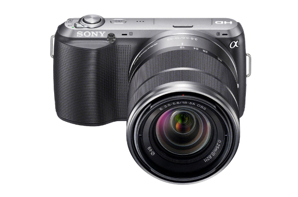
The Sony NEX-C3 is an Amazing Camera

I recently attended Sony’s annual analyst day where they gave us their new NEX-C3 digital camera. The NEX-C3 fits into a category that the industry is calling mirror-less interchangeable lens cameras.

The only real difference between these cameras and DSLR’s are mirrors and a view finder. I was a big DSLR fan but I am now converted to the mirror-less interchangeable lens cameras.

I am more of a hobby photographer than a serious one but I can appreciate innovation in this category. I have owned many different types of cameras but I have to say this Sony NEX-C3 is the most amazing. Sony offers it at a competitive DSLR price of $599 including the 18-55 lens.

There are two features I want to highlight. One is more general and the other is unique to Sony and truly sets this camera apart from the pack.

Real Time Image Post Processing
One of the things I appreciate about using my smart phone as a camera is all the apps that allow for creative on the fly image post processing. I am capable of doing many of the same effects in Photoshop however I am to lazy to do it as often as i’d like.

The Sony NEX-C3 brings a number of on the fly image effect options. Because these cameras don’t have view finders you have to look through, you can see all your image effects in real time with the LCD screen. This way you can make sure you get the shot you want.

This is a feature a number of these cameras, point an shoots and now even DSLR’s are packing but Sony has created a very elegant and simple UI to access and use these on the fly effects.

Here are a few examples of the on the fly effects I thought were extremely useful.

Color Pop

Isolate R,G,B Or Yellow

Auto Panarama

The XMOR Advantage
One thing I learned that I found interesting was that megapixels are becoming less important in this category and instead the focus has turned to the image sensor.

The trend going forward is to pack the largest image sensor into the smallest package. Sony with this camera using their EXMOR image sensor has the lead in this race.

Although that is interesting, what is more interesting and in my opinion amazing is what a quality image sensor will get you. The sensor in the NEX-C3 is 13 times the area of the typical image sensor which results in delivering an exceptional combination of high resolution, high sensitivity and gorgeous, blurred backgrounds. Most other cameras in this category use a micro 4/3rds sensor and Sony’s is a bit larger.

Besides image quality the biggest thing you get is superior pictures in low light situations.

Capturing a quality image in low light, like dimly lit rooms or at night is notoriously difficult. It is something typically reserved for the pro’s.

This single experience of being able to use this camera to take amazing pictures in low light – without a flash or a tripod – is what blows me away.

Besides the EXMOR image sensor, Sony has also added some key software to help capture low light images.

The one in particular – that I am going to use like crazy – is a setting in the camera’s “Scene Mode” menu called Hand-Held Twilight Mode. This setting exists solely to take photos at night without a tripod.

What this setting does is take a burst of 6 images very quickly. The camera then blends all 6 images together to produce amazing photos at night without the need of a tripod. Below are a few examples all taken with no tripod.

     
Camera technology has come a long way. As I stated at the beginning these mirror-less interchangeable lens cameras have made a DSLR convert out of me.

The real question is when will this kind of image sensor technology be available in smart phones? As much as I like this camera i’d love to have many of the features in my smart phone.

This is an interesting category to watch. These cameras still pack a great deal more technology than a smart phone can and because of the size they pack a lot of technology in a very small package.

Android is Finally Ready for the Tablet Market

Over the last few weeks, Android for Tablets (aka Honeycomb) 3.2 started rolling out to tablets like the Asus Transformer and the Motorola Xoom. While the announcement of Android 3.1 was met with great fanfare at Google I/O 2011, Android 3.2 didn’t receive a lot of attention as it started actually rolling out to systems. Ironically, I believe that with the rollout of Android 3.2, the operating system is finally ready for tablet prime-time.

clip_image002

Background

Android 3.X, aka “Honeycomb”, is Google’s operating system for tablets. It was first shown at CES 2011 and the first product it rolled out on was the Motorola Xoom. After its launch, the firestorm ensued and Honeycomb was viewed as having significant issues:

  • Sluggish performance even while having superior hardware specs.
  • Lack of stability and reliability as evidenced through repeated application crashes.
  • Lack of apps. Even as of July 1, 2011, NY Times David Pogue reported that at the most, 232 apps were optimized for Honeycomb. The iPad had 90,000 optimized apps. To make matters worse, Android phone apps ran in a tiny window.
  • Lack of external SD card support. Just do a few Google searches on “SD card” and “Xoom” and you will know what I am talking about.
  • Limited USB connectivity. Keyboards, mice, digital cameras, card readers either didn’t work at all or were very inconsistent.

Needless to say, this didn’t exactly equate to a very good experience, as I have personally experienced on three separate 10” Android Honeycomb tablets.

Improved Performance, Stability and Reliability

Between Android 3.0 and 3.2, my Honeycomb experience is like night and day. Single-tasking responsiveness is close to the iPad 2, although the iPad 2 is still faster. Honeycomb does outperform iPad 2 on multitasking though.

When I use a tablet, I use it as a primary device. I load around 20-30 apps, and I do set up the background tasks and widgets as they are differentiated features versus the iPad. Where I previously experienced between 10-20 application crashes a day, with Android 3.2, I may get one a day. This is a huge breakthrough. And yes, I do get application crashes on the iPad 2. iPad 2 crashes are less pronounced and “hidden” as the app just dies and you are taken to the home screen. In Android, a dialogue box pops up on the screen and you are given the choice to wait, kill, or report the crash.

clip_image004

Improved Application Support

Android 3.2 added the capability for users to better tap into the library of approximately 300-400K applications. Applications come in three forms that are somewhat transparent to the user:

  1. Tablet optimized apps: Resolution, layout, fonts, content are optimized for the tablet.
  2. Stretched phone apps: Phone applications are stretched to tablet dimensions keeping phone layout, fonts, and content. In some apps this is automatic; in others it requires the user to toggle a menu icon in the apps bar.
  3. Zoomed phone apps: Fixed-size phone applications are zoomed in like the iPad phone apps. In some apps this is automatic; in others it requires the user to toggle a menu icon in the apps bar.

If a user runs across a a manually scaled-app, they are given the option to stretch or zoom. Many of the apps, though, were automatic and stretched properly into place.

clip_image006

Here is how some of the top Android phone apps look on Android Honeycomb 3.2 tablet.

clip_image008 clip_image010

clip_image012 clip_image014

clip_image016 clip_image018

clip_image020 clip_image022

clip_image024 clip_image025clip_image027

As you can see, some of the phone apps look really good and others could be improved. The net-net is that Android Honeycomb tablet buyers just got 300K-400K more apps to run on their tablets.

Conclusion

Like the first Android phone OS, the Android tablet OS has quickly undergone a massive overhaul and improvement in a mere 6 months. The most recent improvements in Android Honeycomb 3.2 were virtually unnoticed by many in the press, but ironically, the update improved the experience to the point that Android is finally ready for prime-time.

So does a massively improved experience guarantee success? Of course not. Android still has to deal with its IP challenges, fragmentation, spotty paid video services, and some “me-too” hardware designs, BUT, if you don’t first have a responsive, reliable experience with lots of apps, you have nothing. And Android finally has that for tablets.

Have your say in the comments section below.


The 13″ MacBook Air is the Perfect Notebook

I have used a lot of notebooks in my 11 years as an industry analyst of consumer technology products. In fact I have used nearly every type of design, form factor, performance, and screen size imagenable across notebooks and desktops. Because of that I am convinced that the 13″ MacBook Air is the perfect blend of everything required to be a great computer.

Prior to using the 13″ MacBook Air I used a 15″ MacBook Pro. In conjuction with that Notebook I also used last year’s 11″ MacBook Air. The primary reason for this was I wanted a notebook that was more travel friendly but I also wanted one with enough performance to handle the media processing I do.

After using the latest 13″ Air I have found it to be the perfect blend of portability and performance.

Hardware/Design/Portability/Performance

In my office I have a 27″ monitor that I hook my notebook up to when I am at my desk, making screen size when “docked” somewhat irrelevant. However, I move around a good deal as a part of my job. Whether it’s commuting to clients’ offices all around the Bay Area or traveling the country or the world my notebook is in my bag a lot. Because of that I used to travel with the 11″ Air.

Although extremely portable, arguably the most portable and powerful sub 12″ notebook, I still found the screen size a hinderence to long term use. It certainly sufficed in a lot of ways but I found myself desiring a slightly larger screen often.

The 13″ is the ideal size allowing for a larger screen experience without sacrificing portability.

I also found last years 11″ slightly underpowered when it came to the media processing that I do. I make a lot of HD videos of family and events and such so I need a certain level of performance or I will go insane. Apple says the new models are 2.5 times faster, but the 13″ model is faster still, and surpassed my expectations in handling video and audio processing.

The backlit keyboards are certainly nice but not all that necessary for me. The internal SD card reader is another feature the 13″ has over the 11″ that has been a very nice to have.

At the end of the day, the 11″ is “under-screened” for my needs and the 15″ Pro is just slightly to large for me to travel with comfortably. Fitting right in the middle, the 13″ Air is perfect.

Battery Life
Lastly i’ve been extremely impressed with the battery life of the MacBook Air line. Throughout the last year using the 11″ Air I was constantly shocked how long the battery would go. Especially with what I will consider general use.

It seemed as though I could shut the computer and leave it for a week then pick it up and nearly no battery had drained. I attribute most of this to a true state of “sleep” due to the solid state hard drive. It’s very similar to the iPad experience.

I don’t like to do battery benchmarks because there are so many usage variables. All I can say on the matter is that I can use it for a full day on a single charge. Granted this includes opening and closing my computer as I bounce around for meetings. I’m not sitting stationary working all day on a single charge.

In my opinion all that matters when it comes to battery life is that when you are mobile and not able to plug in you have enough battery to work. In that regard the 13″ Air delivers.

I’ll say it again. The 13″ MacBook Air is the Perfect Notebook.

My 5 Favorite New Features in OSX Lion

After spending some time working with Apple’s new operating system OSX Lion, I’ve landed on my top five favorite new features. Now granted, everyone uses computers differently. So for me and my computing habits these are the ones that lie at the heart of my upgraded experience.

Auto Correct

There are actually a number of very good new features for writing and typing. My personal favorite is a new and improved auto-correction feature that, like iOS, will fix a misspelled word or typo for you as you type.


Once a word is fixed a blue dotted line appears just under the corrected word to let you know it was fixed. This allows you to go back and edit the word if the in line edit was not what you wanted.

I type and write quite a bit and not having to backspace several times every sentence is extremely useful. Now that I have adjusted to the improved auto correction feature, I feel as though I can type more freely and clearly.

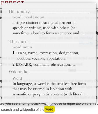
One other feature around text that I am coming to appreciate is the built in dictionary and contextual word search. You can highlight any word you see and right click with a mouse or triple tap on the trackpad to bring up a dictionary as well as contextual word search and wikipedia of the word.

Spotlight

I use spotlight for nearly everything. I do not have a very organized desktop nor do I organize my files very well so Spotlight saves me a huge amount of time. Primarily because although I don’t know where my files are most of the time I do remember the files name. I use Spotlight for more than just files but for programs as well.

The biggest edition to Spotlight that I absolutely love is called Quick Look Results. What this does is allow you to mouse over any of the Spotlight results and to the left of the Spotlight results drop down appears a quick view preview of the actual file. This way if you have multiple files similarly named or just want to make sure the result is the exact file you were looking for you can now see a quick preview before opening.

Another edition to Spotlight that i’m finding quite useful is the ability to drag and drop the file anywhere on your computer right from the Finder results.

Mail

I am a big Mail user and I have been for quite some time. I never could get used to Microsoft Entourage and even when they launched Outlook for Mac I still preferred Mail. Threaded messages, smart folders, integration with iCal and more were what had me hooked. So naturally I was quite pleased with many of the upgrades to Mail.

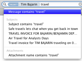
The upgrades to Mail’s search capabilities have to be my favorite new feature. Like my needs to search for files often with Spotlight, I also need to search for emails frequently. I don’t always remember the details of who a specific message is from, I only vaguely remember important things. The last upgrade Apple made to Mail helped be a good bit in this department but the latest upgrade to search has made it even faster and less work to find the email desired.

This is because of an advanced filtering process called search tokens. Search tokens let you filter your search down each step of the way and quickly narrows any and all search results until voila, you find exactly what you are looking for.

I’ve used the threaded messages options in Mail but the newest feature Conversations takes it to a whole new level. This has been fantastic because I tend to have very long conversations through email. By being able to see all the conversations organized and threaded in the same window pane has been a joy to use.

Mission Control

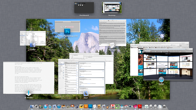
When Apple added Expose to OSX I became an Expose junkie. I keep many applications open frequently and I multi-task jumping between them all just as frequently. Expose drastically improved my work flow efficiency. Mission Control is the next step is multi-tasking efficiency and it certainly lives up to its name. I particularly like how Mission Control organizes all your applications and keep your desktop, dashboard and other workspaces at the top of the screen always accessible.

One of the more enhanced elements of Mission Control that is not possible with Expose is the laying of windows on top of applications. If you have multiple windows open from the same application, Mission Control layers the images on top of each other and allows you to select which you are trying to get to.

Auto Save and Application Resume

Most modern applications have some level of document recovery but Auto Save in OSX Lion makes the process standard. Not having to worry about whether or not a document is saved or work is going to get lost certainly eliminates some of the distraction to work efficiently.

Application resume is another great feature that is built into OSX Lion. This features lets you close an application and upon re-opening you are right where you left off. One of the areas where this is particularly useful is with Safari. I like to leave tabs open with some of my most frequented websites and being able to open Safari and have all my tabs re-open with my favorite websites or the last ones open has been extremely useful.

I’m sure as I use Lion more I will find more features that I love but for now those are my top 5. I’d be curious what those who have Lion think and what your top 5 new features are?

The Revenge of Pen Computing?

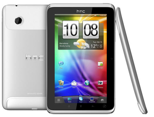
I’ll admit, when I heard about HTC adding pen capability to its tablet, I rolled my eyes and wrote it off. Then I watched HTC’s promotional video on the HTC Flyer and read comments from respected journalists and analysts and knew then I needed to try it out for myself. You see, I have been involved with pen-computing for 20 years, and I have the scars to prove it. Will the HTC Flyer usher in a new generation of mainstream, pen-based tablet usage models?

clip_image002 clip_image004

Cycle of Mainstream Pen-Computing

Over the last 20 years, the industry expectations of mainstream pen-computing have risen and fallen like a scary roller coaster at Six Flags Texas. Don’t confuse this with successful vertical pen-computing in medical, transportation, construction, military, and retail industries.

The mainstream pen cycle has historically gone like this:

  1. Pen-computing is knighted the “next big thing”
  2. The entire high-tech value chain including semi’s, ISVs, ODM, OEM, and distribution invests heavily
  3. Products get shown at CES, PC Expo, and Comdex
  4. Products emerge with very few pen-centric applications
  5. Product sales-in to channels meet minimum expectations
  6. Product sales-out of channels fail to meet expectations and get blown-out at rock bottom prices
  7. The industry retreats, folds its tents, and chases another shiny new thing
  8. In five years, go to step 1 and repeat.

This cycle has repeated itself many times, over and over again.

HTC Flyer Overview

The HTC Flyer, even without its pen capability, is the best 7” tablet I have used and that says a lot, given my affection for the Samsung Galaxy Tab 7.

It’s very peppy and I attribute a lot to HTC’s decision to go with a single core 1.5 GHz CPU versus a lower frequency dual core CPU. That makes sense now because of the infancy of the OS and its application multithreading. Android 2.3.3 (Gingerbread) is VERY stable, light-years more stable than Android 3.X (Honeycomb). The 5MP camera is the best I have used with the exception of the iPhone 4.

clip_image006

HTC Flyer Pen Features

The HTC Flyer is impressive even without pen input, but what about the specific pen features? Essentially, if you see anything on the screen, you can annotate on it. Also, HTC pre-installs a multimedia notes program as well.

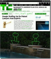
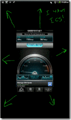
· Annotations: If you are viewing anything on the HTC Flyer, click the pen to the screen and it takes a screen shot. This included web sites, applications, and even photos.

clip_image008 clip_image010

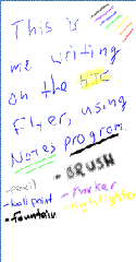
· Notes Program: HTC preinstalls the “Notes” app, a program that can take notes with the pen, text, voice, videos, and even attach files. I believe this is a re-skinned Evernote app with the added pen-inputs as it syncs with Evernote. As you can see on the far-right, it doesn’t improve my handwriting at all.

clip_image012 clip_image014

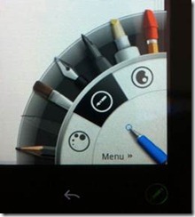
· Multiple Pen Types: I could choose from multiple pen types, colors, and sizes, all by tapping the pen to an icon in the lower right hand corner of the Flyer. As you can see on the far-right, it doesn’t improve my handwriting either.

clip_image016 clip_image018

User Interface Modality

With pen-computing, the user has three modes: pen, touch, and virtual keyboard to do most of their input. I found it difficult to go back and forth between pen and finger, but found a way to do both without having to place the pen down.

Future of Mainstream Pen Input

The pen capabilities of the HTC Flyer are the best I have ever experienced on any mainstream computing device BUT I do not see pen input using a specific pen getting popular outside specific vertical industries. Why? The modality between switching between finger and pen will be an issue for many people. There are solutions, though.

The Problem

If a pen is an impediment to pen computing, what would allow for precise input without the pen? The iPhone only partially solved it with the “finger”. Finger input has two major problems:

· The palm: No other body parts can touch the display, like a palm. Try drawing on any iOS device with your palm resting on the display. Come on… try it.

· Fat finger: On a 7” display, unless you have fingers as skinny as a pencil, they are too imprecise.

Technologies That Can Solve This

· Object recognition: If the tablet can recognize that an object that it “sees” as a pointing device is getting closer and touches the tablet, any object, finger, feather, or ball point pen cap could be the “pen.” Object recognition combines an input sensor and software that identifies what the object is. PixelSenseTM from Microsoft is just one example. Objects could also theoretically be captured and recognized accurately with stereoscopic cameras. Below is a picture I took at CES 2011 of PixelSense object capture in action. This is an image of what the pixels in Microsoft Surface® 2 are seeing.

clip_image020

· Improved touch algorithms: Object recognition is a difficult task but doesn’t solve everything. You identify what something is, but you then need a decision engine that triggers a response. Improved touch algorithms can determine what to do with the finger and ignore the palm of your hand. Or, if it’s a larger display and a painting program, it knows what to do with the palm and the finger simultaneously.

Conclusion

Pen-computing has undergone a roller coaster of ups and downs and has only been successful in vertical industries and specific usage models. Could the HTC Flyer usher in a new revolution of mainstream, pen-based computing devices and consumer usage models? Well, I don’t believe so, and not because the HTC Flyer isn’t an awesome tablet, as it’s the best 7” tablet available right now. The biggest impediment to pen computing is the pen itself, and until the right technologies enable any finger or object to “be the pen”, the usage models won’t take off. The good news is that technologies like object recognition, improved flat panel sensors and algorithms are on their way.

10 Days With the HP TouchPad Tablet

 
As I have described in previous posts on my AMD blog, part of my job entails forecasting future usage models for consumers and businesses. One of the various techniques I use is living with today’s technology and then extrapolating forward. I look at all sorts of hardware and software, and lately I’ve been looking at a lot of mobility devices, specifically tablets. One of the latest products I checked out was the HP TouchPad tablet. I lived with the HP TouchPad for the last 10 days and I wanted to share with you my thoughts. I won’t be extrapolating out five years, but I am intrigued about many aspects of the HP TouchPad.

HP TouchPad Advantages

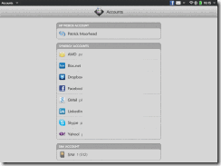
· Setup: I have an HP Veer phone that I had previously setup and the HP TouchPad automatically imported ALL of my accounts. That included Exchange, Box, Dropbox, Facebook, Gmail, LinkedIn, Skype, Yahoo, and even MobileMe. I entered their passwords, and I was connected to everything. This is superior to Android in that it connects non-Google accounts and superior to iOS in that it automatically connects non-Apple accounts. THIS is the way every tablet should be.

clip_image002

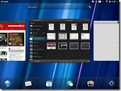
· Real Multitasking: This has been an advantage with Palm products since the inception of the Pre with “cards”. When I mean real multitasking, I mean a way to see what is actually running simultaneously and the ability to quickly switch and/or kill apps and functions. The only thing even close is the BlackBerry PlayBook.

clip_image004

· Synergy: Managing all of the different best-in-breed services is typically very difficult with a tech device. Synergy gathers all of those services and contacts in one place to present an integrated view of an app or a contact. My contact in the HP TouchPad, for example, has 10 linked profiles, consistent with my services. One contact, not ten. Here are some specifics on accounts supported by HP Synergy.

clip_image006

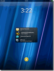
· Notifications: There are two types of notifications, lock-screen and in the activity center in the upper right hand corner of the screen. These are superior to the iOS 4.x notifications in every way and really pull on Palm’s experience and legacy.

clip_image008

· Exhibition Mode: This mode adds utility to the HP TouchPad when it’s charging and/or sleeping. Instead of seeing a blank screen or some silly screensaver, you see a clock, your calendar, key photos and even a very-well designed Facebook page.

clip_image010 clip_image012

· TouchStone Inductive Charging: This is a feature I am surprised others haven’t tried to replicate because it’s just so awesome. The inductive charging feature allowed me to charge my HP TouchPad by setting it on the charger, without having to plug anything in. On other tablets, I continually plug in the unit incorrectly (iPad) or it’s hard to plug in (HTC Flyer).

clip_image014

· Printing: I have personally used over 15 tablets with all the add-ons for printing and the TouchPad was the first one that “just worked”. I have yet to print correctly or easily from any iOS 4.X or Honeycomb device.

clip_image016

· Connecting to Corporate IT: This was the easiest tablets I have connected to my corporate Exchange and wireless LAN. Literally, all I needed was to enter my email address and password and I was connected to Exchange. Its ActiveSync support is superior in every way. On the corporate LAN, all I needed was to email my security token to myself, import it, log-in, and I was on the corporate wireless LAN. The HP TouchPad was the first browser to actually work correctly with our web front-end for SAP.

What I’d Like to See in Future HP TouchPads or Software Releases

· More Apps: Some of my favorite apps are missing that I literally cannot be without. I need apps like EverNote, SugarSync, Kindle (coming), Google Plus, and HootSuite.

· More Pep: Even though the HP TouchPad has some of the highest-specification components like a dual core 1.2 GHz CPU, it didn’t feel like it. It lagged in many areas compared to the iPad 2 and even the BlackBerry PlayBook.

· Browser File Access: Without a specific app, I’d like to be able to upload files through the browser. For example, even if I didn’t have a Google Plus app, I’d like to upload photos via the browser. This requires file system access to do. The BlackBerry PlayBook did this very well and in many ways, compensated for the lack of apps.

· Video Services: There is a placeholder app for the HP MovieStore, but I’d also like to see Netflix and Hulu. Hulu runs in the browser, but it’s also very laggy. If Hulu ran more quickly in the browser, I wouldn’t need an app.

· Video Out: I like to display videos and photos on my HDTV. I cannot do this with the TouchPad, but I can with the iPad, PlayBook, and virtually every Android Honeycomb tablet.

· Video Chat: I tried to use the Skype-based video conferencing but I got no video and crackly audio. The BlackBerry PlayBook and the iPad 2 do video conferencing near flawlessly.

· Synced Bookmarks: I spend, like many, a lot of time on the web, and not just on a tablet. I access the web from multiple phones, tablets, and PCs. I’d like, at a minimum, an Xmarks app.

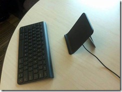
· Mouse: The HP Wireless Keyboard is great, but only solves half the produ

ctivity interface challenge. Reaching across the keyboard or doing “fine-grain” editing is just sub-optimal without a mouse. Android Honeycomb has the best mouse support today, closely followed by the PlayBook.

Conclusion

There is a lot to love about the HP TouchPad and it offers many things that make it stand out amongst the iPad, BlackBerry PlayBook, and Android tablets. Unfortunately, one of those attributes is a low number of applications and some lagginess in certain usage models. HP is a company I have had the fortunate honor to work for (Compaq) and work with for almost 20 years and when they commit to do something, they do it. I expect the issues to be cleared up and when they are, I believe more people will be focusing on its great attributes.

Feel free to give me a piece of your mind. Comments section is below.
 

See Pat’s full bio here or past AMD blogs here.

Follow @PatrickMoorhead on Twitter and on Google+.

Sony Experia Play: The Case for Diversity

There’s a profusion of Android phones on the market and they all have an awful lot in common. They’re almost all rectangular slabs with displays ranging from 3 1/2 to nearly 5 inches and differ mainly in the color of the case and how ronded its corners are. The biggest difference available: Some models feature slide-out keyboards (and thicker bodies) while some offer just an on-screen keyboard. You’d never know from this lot that Android offers manufacturers almost total flexibility in hardware design.
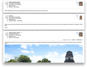
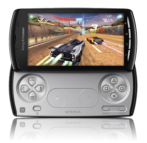
Sony Ericsson Experia PlayThen there’s the Sony Ericsson Experia Play. ($200 in the U.S. with two-year Verizon Wireless contract.) I don’t know whether the Play can revive the flagging fortunes of Sony Ericsson, but I’m glad to see themselves try something really different.

At first glance, the Play looks like every slider keyboard Android: Shiny black, rounded plastic case, 4″ 854×480 pixel display, 6.2 oz. (175 g), a bit over half an inch (16 mm) thick. But when you slide the bottom out, instead of a keyboard you see a game controller pad modeled on those used with the Sony PlayStation 3. In place of keys, you get a full set of gaming controls: the familiar directional and symbol pads, physical select, start, and menu buttons, and two circular areas that are designed to simulate analog joysticks. Games can use all these controls, plus the touchscreen and motion sensitivity.

I don’t play game a lot and I really can’t say how a hard-core game would feel about the Play, but I found it a lot of fun. The screen is crisp, though I had to turn up the brightness manually for satisfactory play. The Qualcomm Snapdragon processor provides more thjan adequate performance.

When not playing games, the Play becomes a standard Android phone with all the expected features. But it’s not likely to be anyone’s choice unless the gaming is important–then it’s just a thick handset without a physical keyboard.

I’d like to see more manufacturers experiment more freely with what Android has to offer. It’s the only viable phone operating system that offers this sort of freedom. Apple’s iOS, Research In Motion’s BlackBerry and (so far) Hewlett-Packard’s webOS are not available to other OEMs. Microsoft, burned by the fragmentation of design of Windows Mobile phones, is keeping a very tight rein on Windows Phone 7 designs.

Android creates the possibility for considerable variety combined with support for core Android features and apps. It’s a tricky balancing act, but it would be good to see more specialized handsets hit the market.


HP TouchPad Review – 3 Things Set it Apart

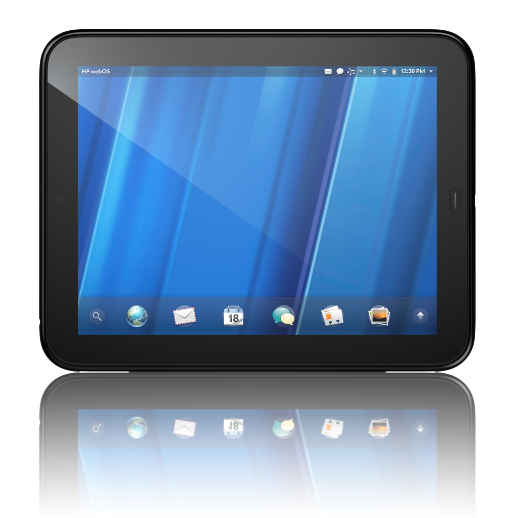
I have been a WebOS fan since it was first released. Actually I have been a Palm fan in general since the first Palm Pilot. So to say that i’d love to see HP succeed with WebOS would be a mild understatement. The Palm Pre devices have evolved and although none have been a massive market success, the Palm team (now part of HP) has learned some key things; they have transferred that knowledge to the hottest part of the tech sector, which is tablets.

I will let the gadget reviewers tackle the speeds and feeds along with all the technical elements of the TouchPad with their reviews. I intend to focus this review more on my opinion of the touchpad, my experience with it, and the things that set it apart.

My overall Opinion

The TouchPad is an extremely good first tablet from HP. WebOS runs marvelously well on a larger screen. I’m not going to go so far as saying it runs even better than on a phone but lets just say that WebOS likes large screens.

The device itself is a bit bulky and heavier than my primary tablet, which is in iPad 2, but still very usable and very portable. The size and weight of the device is comparable to the Motorola XOOM.

Everything about WebOS was clean on the tablet. Gestures, the UI, the speed of the OS; all was fantastic. The only thing glaringly missing was a plethora of apps in the HP App Catalog. I am convinced that if HP had anywhere near the size of an App store catalog as Apple, the TouchPad would make a worthy competitor.

That however is being worked. We are assured from HP that they are in the for the long haul and are investing heavily into their developer programs.

I personally like this tablet quite a bit, more than any Android tablet i’ve used thus far. The software is largely the reason as I like the UI of WebOS and prefer it to Android – just my opinion mind you. The only thing holding the TouchPad back in competing with Android tablets in particular is the apps.

There are however three key things that set the TouchPad apart and are worth pointing out..

Multitasking

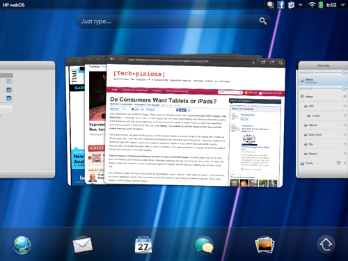
I firmly believe that at this point in time WebOS does the best job multi-tasking of any tablet i’ve used to date. WebOS accomplishes this with their “Card View” metaphor where you can see all the apps you have open as slightly smaller windows. With a quick finger swipe gesture “up” from the bottom of the TouchPad you quickly enter the card view.

You can also stack apps on top of each other to create space for multiple card view working environments. Ultimately this lets you have more apps open at one time, letting you jump back and forth between a larger selection of applications.

Multi-tasking is a key part of the tablet and touch computing experience because it allows you to quickly move in and out of apps to accomplish whatever it is you seek to accomplish. An example would be surfing the web, checking a quick e-mail then back to surfing the web again.

Dock aware Exhibition Mode

This is one of the areas I think has the most potential for WebOS. Because the TouchPad charges by simply sitting in the dock, with no need to plug in, HP has designed a way to make each dock location aware.

This means you could set up multiple TouchPad docks, one near your bed, one in the living room, and one in the kitchen. Then you can set your TouchPad to show a different exhibition mode depending on which dock the TouchPad is sitting on. So when my TouchPad is docked next to my bed it would display a clock and the when sitting in the dock in the living room it would display a photo slideshow.

What’s more is that HP has put  into their software development tools the ability for developers to creatve new apps that take advantage of the location aware docks and exhibition mode. So we can expect new apps that take advantage of the location aware dock and exhibition mode to show up in the HP App catalog shortly. I am looking forward to a recipe mode for when the TouchPad is docked in the my kitchen.

Touch to Share

The last real differentiator I want to focus on is touch to share. This is a concept I think is quite interesting.

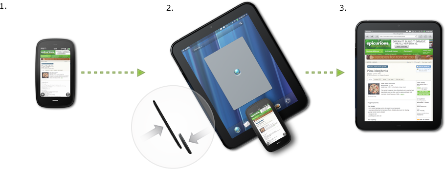
The basic idea is that if you are viewing something on one WebOS device, like the TouchPad, and you want to transfer what you were viewing to another WebOS device, like a Pre. All you do is touch one to the other and what was on the screen on one device shows up on the other.

The concept is simple but powerul. When you are managing or moving from device to devic,e frequently this solution becomes quite useful. At launch Touch to Share will support transfering a web page from one WebOS device to another.

In the future however you can imagine using this for music, movies, photos, documents and more.

Because your WebOS devices are paired together, you can also use the touch to share technology to recieve and answer phone calls and text messages directly on the TouchPad. This is accomplished by using the cell connection on your Pre or any other WebOS based device.

Summary

As you can see HP is not only deeply commited to developing great hardware like the Pre and the TouchPad, but also to further developing the WebOS ecosystem.

What I praise the most is HP’s vision to create experiences where your HP devices work better together, touch to share being a great example.

The TouchPad represents a premium experience as a tablet. A lack of apps are the only things currently holding the TouchPad back.

Time will tell how long it takes for HP to get a critical mass of quality applications in their catalog. There are at launch at least enough name brand apps to keep the early buying base satisfied. But Web OS is a solid mobile OS and HP is tailoring it to meet the need of a broad range of customers. I consider it a very comptetive product and one that has serious market potential.

Wacom Bamboo Stylus for iPad Review

I’ve said it before and i’ll say it again, I am a fan of the stylus. I love touch computing don’t get me wrong but there are certain use cases with tablets where I believe a stylus accessory makes sense.

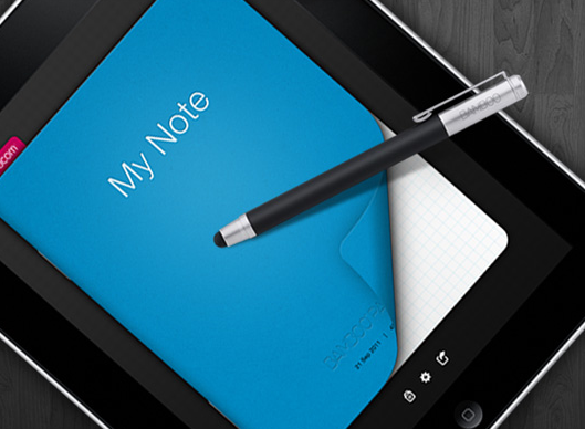
When I reviewed the stylus implementation of the HTC Flyer I noted that it was the best implementation to date and I still believe that. Primarily because the stylus was integrated well into the whole of the tablet. What Wacom has done with the Bamboo Stylus for iPad is the best stylus implementation on the iPad I have used.

The Stylus


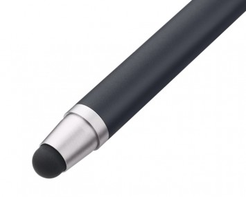
When you first hold the Bamboo Stylus in your hand you will note that it is very well balanced, much like a nice pen. The official weight of the pen is 20g. The feel is solid and sturdy and sits nice in the hand like any fine writing instrument.

What sets the Bamboo Stylus apart is the width of the tip. Which is 25 percent narrower (6mm vs. 8mm) in diameter than other Stylus on the market. This allows for not only more precise accuracy but also a smooth pen on paper feel while writing on the screen.

The challenge of any stylus is to create a feeling as similar to writing on paper. The narrow tip and texture accomplish as close a feeling to paper i’ve used yet.

The App

What the folks at Wacom did, that was brilliant, was they included a free app that goes along with the stylus. This way they could include specific things to make their accessory work even better. This app is called Bamboo Paper.

Its a very simple app that lets you create a book of notes. You can change the color of the book as well as choose from blank, ruled or grid style paper.

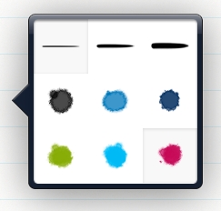
Inside the app is where some of the great work Wacom did with the software shines. For example pressing and holding on the screen brings up the pen options to change width and color of the stroke.

There is a menu at the top of the app that gives you quick buttons to email the current page or the whole book, undo and redo, change pen options, choose eraser, create a new page and bookmark the current page.

Writing

As I stated earlier, the challenge of any tablet + stylus experience is to mimic as closely as possible writing on paper. Too often when writing with a stylus on tablet screen it feels slippery or glossy. Which makes being precise more difficult. Writing with the Bamboo stylus was as close to writing on paper as i’v experienced. The tip length and the rubber texture add just the right amount of resistance and in the process mimic a pen-on-paper feel.

The pen was also very precise and I felt my writing was very similar to what my handwriting looks like on paper. Normally this is not the case with tablets and stylus.

What was equally as important, which must tablet + stylus implementations fail at, was the software’s ability to distinguish between my palm or hand and the stylus. Too often writing becomes difficult if the app recognizes the palm and either doesn’t let the pen write or makes small dots everywhere the palm touches.

With the Bamboo paper app I could confidently rest my palm on the screen to write and focus on writing and taking notes.

Wrap Up

If you are looking to use your iPad to take hand written notes I highly recommend this setup. I would obviously like to see they stylus work with more iPad apps. For example marking up documents, web pages, presentations etc.

Wacom does state that the Bamboo Stylus does work and has been tested with a few other apps, check out the full list of supported apps here.

GoodReader is one of the supported apps that will let you mark up images, PDF documents and more. One way I did find to mark up websites, images, documents, and more was to take a screen shot on the iPad then open the image in GoodReader to use the Bamboo Stylus to make markings. It is a little bit of a hack but it suffices for the time being.

Ultimately I may be in the minority but i’d love to see Apple make a stylus accessory for those of who want to use our iPad to draw, handwrite, mark up important documents and more. But for the time being the Bamboo Stylus will be my go-to solution.

BusinessWeek for iPad Review: Best Magazine App So Far

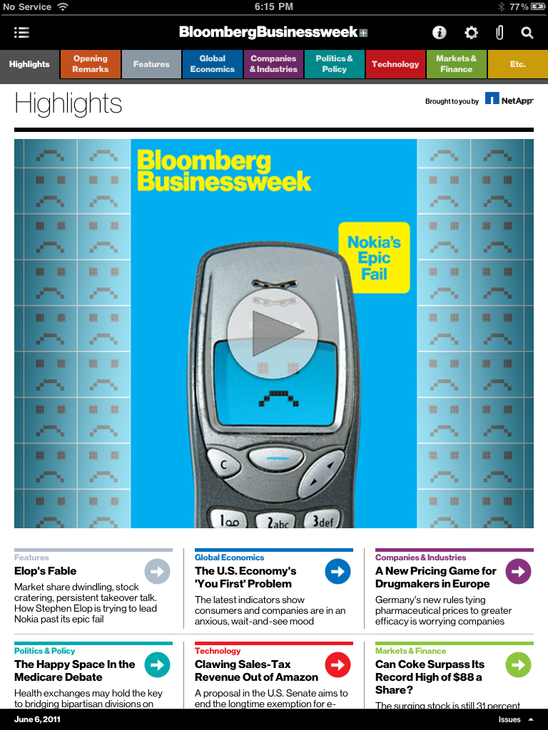
I’ve been using the Bloomberg BusinessWeek iPad App for about a month now and I have to say I prefer it hands down to reading the physical magazine. Mostly because BusinessWeek did not simply try to re-create the BusinessWeek experience on the iPad, instead they re-invented it.
Continue reading BusinessWeek for iPad Review: Best Magazine App So Far

HTC Flyer: To Stylus or Not to Stylus

I want to focus the thoughts of this article purely on the HTC’s implementation of a stylus on their Flyer 7″ tablet. When Steve Jobs said “if you see a stylus, they blew it,” I believe he meant that if a tablet or computer required a tablet for navigation and input it has failed. To this I would entirely agree.

I believe the stylus alone should be viewed as an accessory, not something the tablet experience depends on. I believe HTC understands this and all though the implementation isn’t perfect it is still by far the best stylus implementation to date.
Continue reading HTC Flyer: To Stylus or Not to Stylus

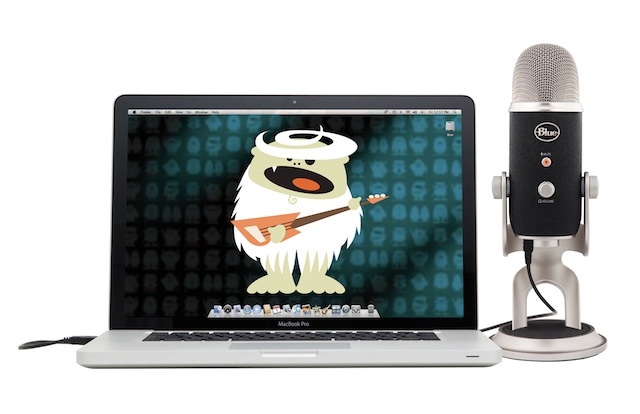
Blue Yeti Pro Review – Great to Use and Look At

Let me start off by saying I have a thing for microphones. I am not exactly sure why, since I rarely use them. I don’t do much personal podcasting but I do contribute to several.

What I mostly use microphones for are VOIP calls, acoustic instrument recording and vocal recording- all just for fun. Those use cases were the the primary ones I tested. The Blue Yeti Pro let’s you connect VIA XLR through a powered amplification source or VIA USB. Most of the microphones I use, I plug in VIA XLR but in this case I wanted to test the USB audio quality. The Yeti Pro boasts recording at full 24 bit rate and 192 khz sample rate. Inside the housing to capture audio is 3 Blue-proprietary 14mm condenser capsules.

To test I ran a series of audio quality tests so let’s start with audio quality.
Continue reading Blue Yeti Pro Review – Great to Use and Look At