Wolfram Alpha may finally be making the big leap from interesting curiosity to generally useful tool.
 For the 2 1/2 years of its existence. Alpha has had something of an identity crisis. It’s sort of a search engine, but instead of crawling the web for results, it relies on a large set of curated databases. At its heart is the computational engine of Mathematica, so it can do some amazing things with that data. When you asked it a question that it knew what to do with, it could produce very interesting, sometimes surprising, analytical results. But it often bombed on simple queries that Google handled with aplomb. It could tell you the distance between San Francisco and Buenos Aires (6,456 miles or 35 light milliseconds) but not where to find a nearby pizza. Alpha got a considerable boost when Apple chose it to handle computation-based queries from Siri–the New York Times reports that Sire generates a quarter of Alpha’s traffic–but it remained a bit of an oddball service.
With the launch today of Wolfram Alpha Pro ($4.95 per month, $2.95 for students), the service is promising to get a lot more useful. There are loads of new features that make the pro option well worth its modest cost. One big change is that you get a persistent account, in which past analyses are remembered and can be modified. Another the ability to upload your own data for analysis and then to download any of the analytical results, including some very sophisticated graphics.
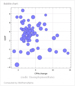
As a simple test, I uploaded about 65 years worth of government data on U.S. growth of gross domestic product, change in the Consumer Price Index, and the unemployment rate. After an initial glitch, in which Alpha interpreted a column headed “Real GDP” as representing amounts of money in Brazilian reals, it gave me an instant deep analysis of my data. As I would have expected, it should a fairly strong relationship between GDP growth and unemployment, but no significant correlation between inflation and either growth or unemployment.
 The bubble chart on the left is an example of the sort of thing Alpha does automatically. It’s a sort of three-dimensional graphic, in which the y-axis represents GDP growth in a given year, the x-axis is inflation, and the size of the circle represents the unemployment rate. Other data generated include scatter plots, histograms, a regression equation, a covariance matrix, and principal component analysis for analysis of variance.
Using Pro, you can also perform analysis on Alpha’s extensive databases and download not only the results but the raw data (there are some restrictions on data exports imposed by Wolfram’s licensing agreements with the data suppliers.) CEO Stephen Wolfram describes the service as “all the tools a data scientist would have combined with knowledge of the world.”
Another feature offered by the Pro service is analysis of images. Upload a photo and alpha will perform a range of analyses on it, including metadata, color analysis, intensity histograms, edge detection, and even some basic editing tools. Nothing that Photoshop can’t do, but its quick and easy.
The real prize in Alpha Pro, though, is the data analytics. You can learn a lot when you start looking at your data in more depth than yu can get from a spreadsheet. Alpha makes it cheap and easy to get started.
